Features
Infographic: 7 of the worse football kits ever made
We’ve seen some horrendous football kits over the years and this infographic from Stand-Out has taken a look at 7 of the worst kit designs ever produced.
Football clubs now change their kits every season with many of the top teams releasing up to three or even four different shirts to choose from every year for various competitions.
Therefore, the designers have had to get pretty creative which has led to some horrendous kits over the years and this infographic from Stand-Out has taken a look at 7 of the worst kit designs ever produced.
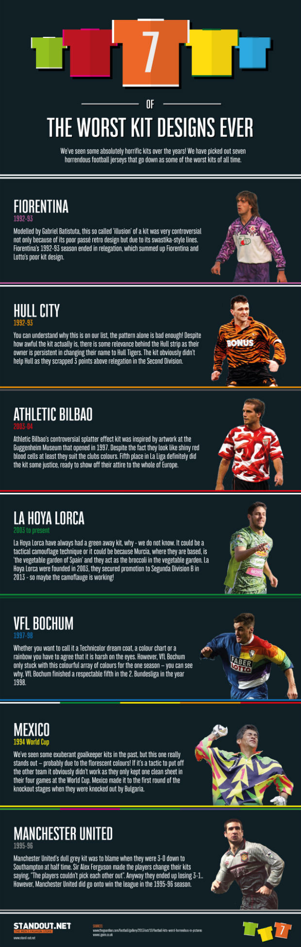
I’m sure we all remember Manchester United’s grey away kit during the 1995-96 season. It was as dull as dishwater and Sir Alex Ferguson famously blamed the kit for his side being 3-0 down at half-time to Southampton, saying the players couldn’t see each other.
The fiery Scot made his players change in to their third kit for the second half but they still ended up losing 3-1 – although despite their awful away kit, the Red Devils still went on to lift the Premier League title that season.
VFL Bochum’s rainbow effect shirt from the late 90’s also features on the list along with Hull City’s ‘Tiger print’ home kit that they wore during the 1992-93 season and Fiorentina’s ‘illusion’ kit from the same year.
However, my personal favourite has to be Mexico’s famous goalkeeping shirt for the 1994 World Cup. The unusual mix of florescent colours made their keeper really stand out but unfortunately it didn’t help put the opposition strikers off as they only kept one clean sheet before crashing out to Bulgaria.
Check out 7 of the worst kits ever made below:

Other News